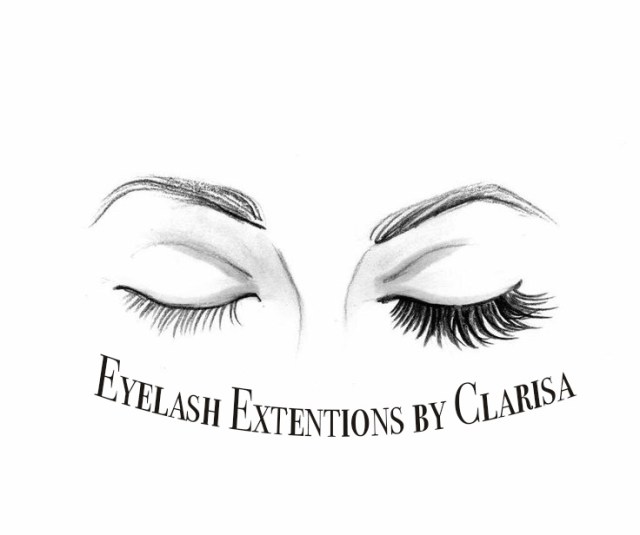
For this graphic design project, I decided to go the route of a magazine ad for eyelash extensions by me. To gain inspiration for this project I wanted to look at some other magazine ads for beauty products and they all seemed to be very busy looking and kind of distracted me from what I was being sold by the ad, so I decided to go with a sophisticated and simpler look to offset that I felt that way when looking at most beauty ads. The reason I decided to go with a more sophisticated look for my ad is because the audience I would want to attract are sophisticated women between the ages of about sixteen and about fifty. I found that it was quite hard for me to find a real photo of eyelash extensions that ended up looking good with the element of text and other elements of the ad, so I decided to find a photo of a drawing of eyelash extensions instead because I felt that it better depicted what eyelash extensions are and how they actually look. The drawing I used was from a website for eyelash extension training from www.hercampus.com/school/uncw/eyelash-extensions-are-they-worth-it. I really liked finding different ways to manipulate the text that I used in the ad and decided to inversely arc the text so that it complements the drawing of the eyelashes as it hugs the bottom of the drawing. I also used the burn tool to make the eyelashes and eyebrows have better contrast so that that part of the image would stand out more as well as a few other things that I learned in photo shop. Although I like how sophisticated the ad is, I believe it is a bit too simple, I would like to find a way to add just enough color and texture so that the ad still grabs the eye yet does not bring down the sophistication of the ad. Hope you like it!
